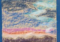
This is the reference photo.
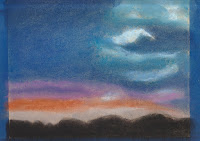
 This is my finished painting.
Now your painting is ready to start. Some artists will plan ahead so far as to pick out all the colors they plan to use in their painting. I would rather let the process flow as I work so I begin with the obvious main color choices. As you use a color, set it aside separated from the other pastels so you will know what you have used. Often the same colors as you put in the sky and clouds will be reflected in water. It is good to use every color choice in more than one place to create a symmetry in the composition. There is no water in this photo reference to worry about but setting aside the pastels you use in your painting is a good practice is always helpful.
READY, SET, GO!
 To set up your picture you will need to tape an edge. This is painter's tape because it will pull off the paper easily when you are finished. Pastels smear very easily so making a border on your paper comes in handy for handling the finished painting. I have a template I made from some cardboard. It is the exact size of an opening for a mat used to frame a 8x10 picture. I tape the paper so the painting will be slightly larger than the 8x10 mat opening. This way I know my paining will easily fit the mat.
First it is always a good idea to lay down some kind of outline, especially where you will put your horizon line. Use a color pastel or pastel pencil that you can see but will not be to hard to cover as you work or even erase for that matter. This is a guideline so you do not get your composition out of proportion. Never put your main focus in the
 center of the paper. In this photo the horizon line is unusual because this picture is all about the clouds. Use the bottom black area as your horizon. It will help to sketch in an outline you like for this area. Go ahead and use black for this picture as it will be black in the finished version. This image is the first layer of my painting. Looking at this you will probably be thinking, "What in the world is that supposed to be?" Bend each color separately and then add a couple more layers. Right now you can see the paper color and texture. The more layers you blend the more smooth and velvety your painting will become. Periodically lift the paper and tap the dust off. You can't tell by the image here but there is a layer of dark brown, with dark purple over it. Black is never really just black but is made up of several colors.
There is a rule about skies and clouds. Each one is a little different. Clouds change according to the time of day, the weather, the season, and other factors. Clouds keep moving and ever changing. When doing the colors for sky and clouds you want to blend in circles. If you were doing water you would blend from side to side because that is how water flows. The main thing to remember is colors of the sky are darkest at the top and as they come closer to earth, the get lighter. To begin with your colors, start from the top and work down. Chalk dust will gather. Try to rub in as much as you can. You can tap off excess dust from time to time or blow it away. Blowing it up will get dust mixed in your lighter colors.
As you blend you an use circular motions as this all clouds. Keep your fingers clean. I keep a wet rag and a dry rag handy. If you blend using a dirty finger you will get a dirty color. Now with each layer start blending each strip of color into the next very gently and slightly. Eventually you want the sky to look natural and a graduation of colors. In your final layers you will add the white of the clouds. Adding it in the beginning layers makes some color areas lighter.
You will be laying down several layers building up your colors. Beginning layers are usually done with a light touch and toward the end you will use pressure to make your final detailed layers. If you don't get enough of the pastel worked into the paper, it will show through. It is a look but I like to get mine as smooth and velvety looking as possible. Blending mutes your colors so for the final detail layers very little or no blending is used, It depends on your painting.
 After layer three the texture of the paper will most likely be showing through your colors not sticking. At this point I use a fixative spray which sets the colors and does make them a little darker. It also builds more tooth in the paper to hold your last couple layers. As you work with your painting, let it speak to you. If your colors change, let it happen if it looks right to you or if it is pleasing to you. You are not taking a photo but creating an interpretation that is all your own and only you can create. You are the artist. Let your painting flow.
In the final I used a small touch of black in the top blue to intensify the color. The bottom area has layers of dark brown, dark purple, random places of dark blue and black over top. Now is time for the final couple layers. You will define your clouds and highlight the light areas under them. The pink clouds are rather billowy so they need to be defined as clouds like the white ones. To make anything appear 3D you use a dark shade, a medium shade and a light color for the top, blending extremely softly just to smooth any hard edges. You can use pastel pencil or charcoal pencil along the top of the dark edges to make fine details or you can use the edge of your pastel stick. Here is how mine turned out.
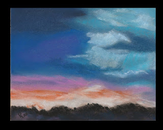 I used circular motions for the clouds and just did an upward swipe with the flat side of the pastel stick for the light rays. In person what appears to be white over the bottom dark area is actually a very light orange. It just never shows up on photos. Skies and clouds are fun. There is a freedom in the creating process because no clouds are the same and it is easy to let the painting tell you what it wants to be. For the final black on the bottom top edge of the dark area I used little squiggly strokes to create what might be trees or buildings in the far distance showing up against the clouds. So, there you have it. My final image is similar to the reference photo but it is my creation at the end of the day. I hope this helps your journey in pastel paintings.
 Original photo from Unsplash.com


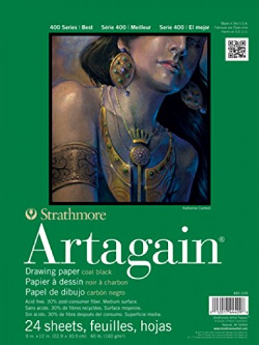 This is my favorite paper. I will explain why.